What Dashboards Never Tell You on a Tuesday Morning
The dashboard was beautiful. Soft gradients. Calm colors. Tiny animations that made it feel alive. It looked like something that knew what it was doing.
I stared at it for a while. Then I closed the tab and went back to Slack, where the real decisions were happening.
That’s when it hit me: the dashboard wasn’t broken. It just wasn’t built for humans.
Dashboards are the new spreadsheets. Impressive. Dense. Quietly ignored.
Every SaaS product ships analytics. Almost none ship judgment. Most dashboards were designed around a comforting idea: more visibility equals better decisions. Show people everything and trust them to figure it out.
But operators don’t live in neutrality. They live in Tuesday mornings, low energy, three messages marked “urgent,” and the sense that something important is slipping through the cracks.
They’re not asking:“What’s happening across the system?” They’re asking:“What should I touch today, and what can safely wait?”
Dashboards almost never answer that.
When everything is important, nothing feels urgent.
I’ve seen the same pattern repeat across teams. A new analytics tool launches. Everyone checks it obsessively for a week. Then usage quietly drops. The dashboard still exists, still updates, still looks confident, but it no longer shapes decisions.
This isn’t a UX failure. It’s a psychological one. Dashboards don’t reduce decisions. They multiply them.
Every chart is a question.
Every metric is a possible worry.
Every trend line is an invitation to second-guess yourself.
Analytics without judgment is just anxiety with better typography.
And the research backs up what operators quietly experience: data alone doesn’t make decisions easier, the human brain still has to interpret it through a filter of cognitive limitations and biases. (ILWLLC)
There’s a deeper reason most analytics tools feel hollow: they’re afraid to be wrong.
If a product tells you exactly what to focus on and it’s wrong, you’ll blame it. If it shows you everything and you feel overwhelmed, you’ll blame yourself.
So we built an entire category optimized for plausible deniability.
Neutrality feels safe. Judgment feels risky. But neutrality is the risk.
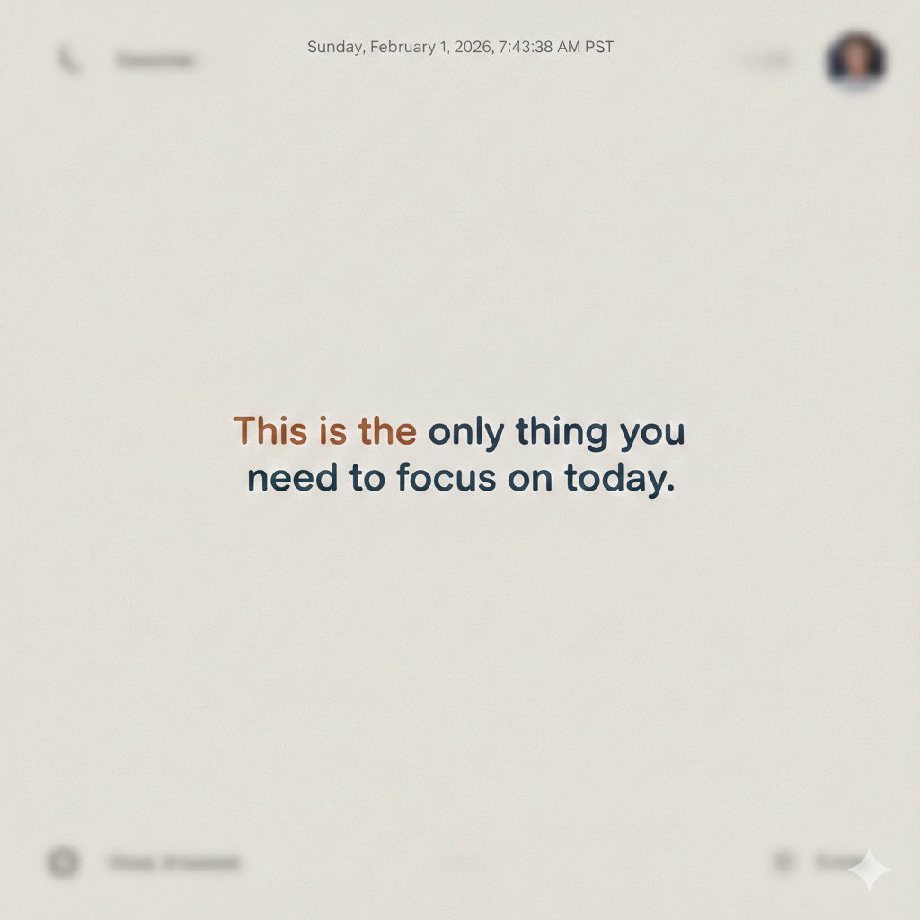
I started imagining a different kind of interface.
You open it in the morning. There’s no grid. No filters. No dropdowns begging to be configured. There’s just one sentence: You don’t need to worry about most things today.
Below it: one issue. One risk. One suggested action.
Everything else is crossed out. Muted. Greyed away like yesterday’s news.
Not because it isn’t important. Because it isn’t important now.
The best tools don’t make you feel informed. They make you feel calm.
That’s not analytics. That’s editorial.
Editors have always mattered more than librarians. Librarians preserve information. Editors decide what earns attention.
As information becomes abundant, curation stops being a luxury and becomes infrastructure. We’ve trusted editors for centuries because attention has always been scarce.
Software forgot that.
AI is supposed to change everything, but so far we’re mostly using it to generate more dashboards, faster summaries, cleaner noise. Better reporting. Same problem.
The real opportunity isn’t AI as a smarter reporter. It’s AI as an editor with taste, the kind that knows when not to speak and when to soften the noise.
The real promise of AI isn’t speed. It’s restraint.
This is why dashboards are quietly dying. Not in a dramatic way. No funerals. No declarations of obsolescence. They’ll fade the way spreadsheets faded, still around, still useful, but no longer trusted to tell you what matters.
The tools that win won’t help you see more. They’ll help you decide less.
And one day we’ll look back at old dashboards, endless charts, blinking indicators, everything screaming for attention, and wonder how we ever mistook that for clarity.
These are companies circling the “beyond dashboards / decision intelligence” space from different angles.
Decision Intelligence / Judgment-First
Rwazi — https://www.rwazi.com
Quantexa — https://www.quantexa.com
Tellius — https://www.tellius.com
Viewpoint AI — https://www.viewpoint.ai
Signal Synthesis (Not Just Charts)
Enterpret — https://www.enterpret.com
Pecan AI — https://www.pecan.ai
Aible — https://www.aible.com
AI-Native “What Should I Do?” Tools
Causely — https://www.causely.ai
Anodot — https://www.anodot.com
Sisu Data — https://www.sisudata.com
Calm / Reduction-First Productivity Adjacent
Linear — https://linear.app
Superhuman — https://superhuman.com
Chronicle (editorial data storytelling) — https://chroniclehq.com
Weird / Edge-of-Internet Energy (Early Signals)
Observable — https://observablehq.com
Hex — https://hex.tech
Numbers Station — https://www.numbersstation.ai
Industry Chatter: From Dashboards to Decisions
For the Curious Minds
Psychology & Design
📘 Thinking, Fast and Slow — Daniel Kahneman
📘 Scarcity — Sendhil Mullainathan & Eldar Shafir
📘 Ruined by Design — Mike Monteiro
Historical Signal
📕 The Attention Merchants — Tim Wu
📕 Amusing Ourselves to Death — Neil Postman
Final Signal
The future of productivity tech won’t be about more dashboards. It’ll be about fewer decisions.
And the tools that help you decide less, albeit wisely, will be the ones people trust.
This essay explores why traditional dashboards overwhelm users and how emerging productivity tools and AI decision intelligence platforms are shifting toward judgment, prioritization, and cognitive relief.