From Bauhaus to iOS: The Secret History of Clean Design (from the notes archives)
An old archived essay.
Swipe open your phone. A field of light blooms, soft white against the dark. Icons wait, quiet, rounded squares, arranged in calm rows. To most of us, this feels natural, inevitable. But the roots of this clarity stretch back more than a century, to a school in Weimar that dreamed of stripping the world down to essentials.
The Bauhaus wasn’t merely a school of art and architecture; it was a sanctuary against chaos.
A School That Thought Like an Operating System
In 1919, as Europe reeled from war, Walter Gropius imagined a new order. No more gilded ornaments, no more flourishes for their own sake. Instead: geometry, discipline, harmony. The Bauhaus believed that beauty lay in clarity, that the grid could be as humane as a poem.
But the true marvel was not the famous chairs or buildings. It was the invisible logic beneath them.
Herbert Bayer’s Universal typeface pared letters to their bones, no capitals, no serifs, only elemental strokes. A language as spare and legible as machine code.¹
Anni Albers’s textiles shimmered with repeated weaves, each thread part of a greater grid, like pixels anticipating a digital future.²
László Moholy-Nagy’s light experiments treated illumination as raw material. He spoke of “a new vision through light,”³ unknowingly sketching the metaphysics of the glowing screens we now cradle in our hands.
The Bauhaus was not producing objects. It was producing interfaces, ways of ordering perception.
Design as an Antidote to Noise
Every wave of minimalism rises from the ruins of excess.
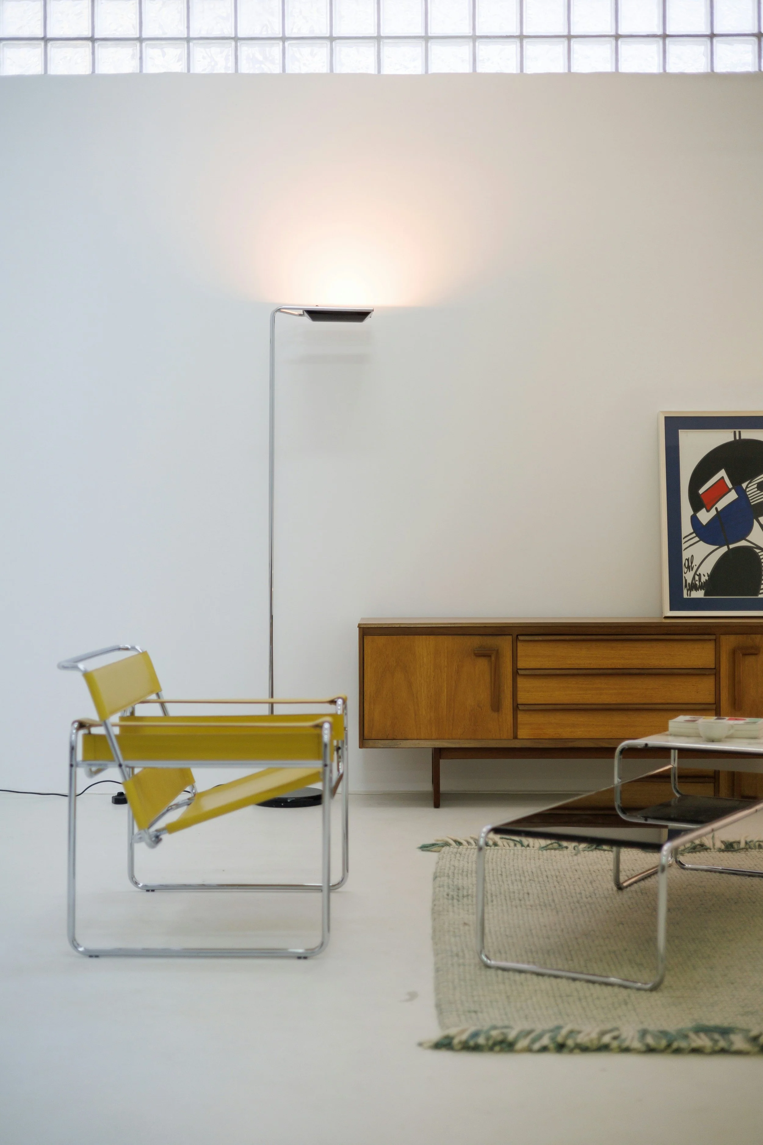
The Bauhaus emerged from the din of war propaganda and ornamental clutter. Its answer was geometry, proportion, and stillness.
A century later, we experienced our own visual overload: skeuomorphic leather calendars, faux-wood shelves, and the noisy bricolage of MySpace. Then, in 2013, Apple wiped it all away with iOS 7: flat planes of color, air-light fonts, a return to order.
Minimalism, it seems, is not a style. It is a therapy, an immune response to the fever of too much.
The Secret Language of Calm
Clean design does something deeper than please the eye. It speaks to the body.
Rounded corners comfort us. Neuroscience shows we process them faster and trust them more, our brains still wary of sharp edges from an evolutionary past.⁴
White space slows the pulse, creating rhythm, almost like breathing.
Subtle motion, fades, slides, elastic bounces, tickles our dopamine pathways. Moholy-Nagy’s kinetic sculptures live on in the swipe that glides across glass.
The reason clean design endures is not ideology. It is biology.
Mercy in Geometry
Strip away the steel, the glass, the pixels, and the doctrine of “less is more,” and what remains is something startlingly human.
A Bauhaus bench, cool to the touch, offers the weary body a moment of rest. A blank Notes app offers the restless mind a space to think. Across a century, the same promise is whispered: clarity is a kindness.
The secret history of clean design is not about austerity or discipline. It is about mercy, the geometry of calm, the gift of stillness, the architecture of thought.
From Weimar to Cupertino, the lesson holds: in a noisy world, simplicity is not a constraint. It is freedom.
Sources:
Herbert Bayer, On Typography (New York: Reinhold, 1967).
Anni Albers, On Weaving (Middletown: Wesleyan University Press, 1965).
László Moholy-Nagy, Painting, Photography, Film (Cambridge: MIT Press, 1969).
Don Norman, The Design of Everyday Things (New York: Basic Books, 2013).