Micro-Rest Interfaces: Designing Moments of Stillness in a Noisy Digital World
In the race to optimize engagement and engineer stickiness, we’ve overlooked something deeply human: the need to pause. To breathe. To be. While most UX patterns are built to capture attention and extend time-on-platform, I believe the next frontier of Human-Computer Interaction (HCI) is not in doing more, but in doing less, deliberately, beautifully, and with care.
As a researcher-artist-strategist hybrid, I’ve often asked: Can an interface be a sanctuary? Can technology create space for us to rest, not just sleep, but emotionally, cognitively, even spiritually? I call this emerging genre Micro-Rest Interfaces digital touchpoints designed not to demand, but to disengage. To intentionally offer the user a moment of stillness, silence, or micro-meditation.
Why It Matters
Most people scroll not to discover—but to escape. Yet our interfaces rarely return the favor. They take attention. They give dopamine. But they don’t give peace.
Inspired by the work at Stanford’s d.school and its philosophy of designing for emotional wellbeing, I began exploring what it would mean to architect rest into everyday apps. What if Gmail offered a 30-second breath ritual after you hit send on a stressful email? What if LinkedIn had a silent reflection mode after scrolling for 10 minutes straight, reminding you that your worth isn’t just your resume? What if Spotify gently nudged you to close your eyes and listen, not just consume?
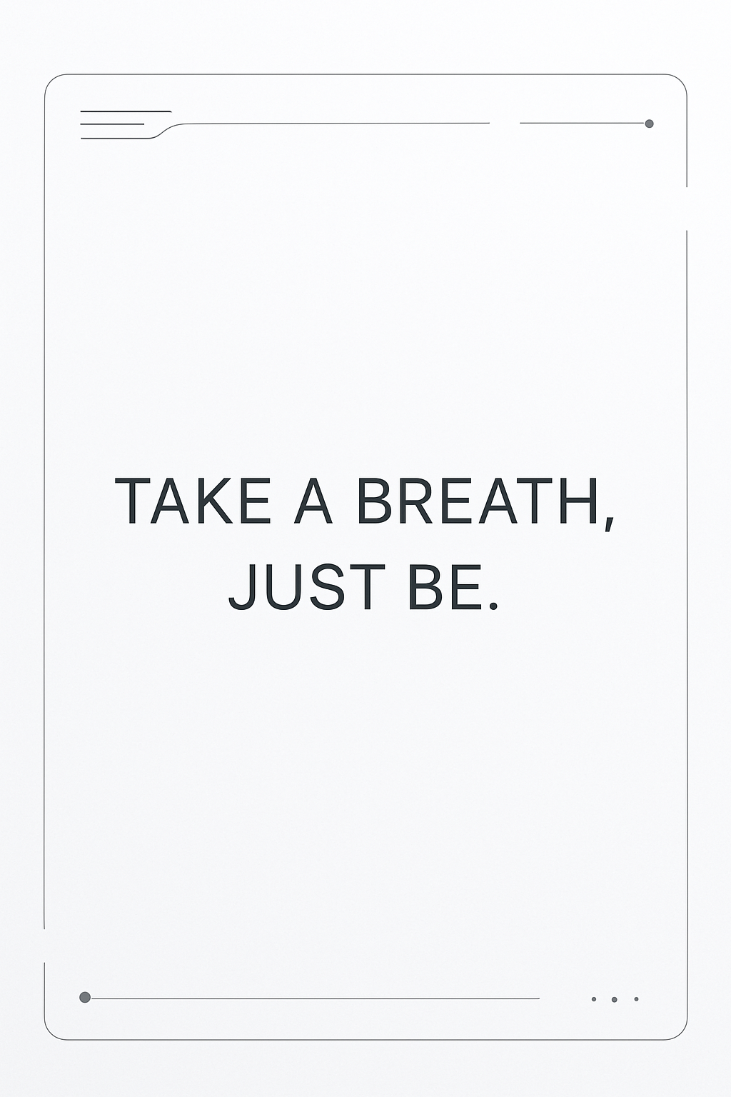
Take it easy!
The Design of Absence
Micro-rest interfaces aren’t just features. They are invitations. Invitations to:
pause before making a reactive choice,
take three breaths before replying,
reflect for a moment before scrolling again.
They require a new design language, subtle animations, ambient audio, generous whitespace, and optional interactivity. Inspired by Japanese Zen aesthetics and the silence in Sufi poetry, I think of them as “digital wabi-sabi”—imperfect, impermanent, yet profoundly human.
My Approach
Drawing from my background in visual art, poetry, and UX research, I explore how:
color psychology can signal emotional rest,
poetic microcopy can anchor reflection,
biometrics (like heart rate) can trigger stillness prompts,
strategic friction (slowing down flows) can improve long-term wellbeing.
At the intersection of design thinking, behavioral science, and contemplative traditions lies a new HCI challenge: Can we build systems that let users feel whole again?
Toward a Rest-Positive Design Ethos
IDEO taught us to design for extreme users. MIT Media Lab showed us we can augment cognition. Now, I propose we design for the overstimulated. For those who scroll through grief, anxiety, or loneliness. For the burnt-out creatives, the exhausted mothers, the doomscrollers seeking a breath.
Micro-rest interfaces aren’t about metrics. They’re about meaning. In a world that pushes us to be always on, they whisper: You can just be.